How to Improve Food Presentation in Delivery Packaging: Box Design, Branding & Food Protection
Food Delivery Presentation: 7 Packaging Rules That Work
Foodservice Packaging Masterclass
How to Improve Food Presentation in Delivery Packaging: Box Design, Branding & Food Protection
A burger arrives with the patty slid to one side, sauce smeared across the lid, and a bun that looks like it lost a fight. That order is not getting a second chance. In the delivery economy, food presentation is not a luxury—it is a functional prerequisite for repeat business. Here is exactly how to fix it.
A plate presented tableside in a dimly lit dining room is a luxury. A takeout box opened on a kitchen counter is the new reality. According to the National Restaurant Association, off-premises dining now accounts for more than 60% of restaurant revenue. The visual appeal of food does not vanish when it leaves the kitchen—it migrates to the package. Consumers eat with their eyes first, even when the table is their own.
This guide breaks down every variable that determines how your food looks when it arrives: box dimensions, headspace, window packaging, venting, sauce separation, branding, grease resistance, stackability, and social-media readiness. Each section addresses a real question that restaurant operators and packaging buyers ask, backed by industry research and foodservice engineering principles.
Why Food Presentation in Delivery Matters More Than Ever
Presentation is no longer confined to the dining room. A 2024 study on packaging influence found that 51% of consumers say the quality of packaging affects their likelihood to reorder from a restaurant. That number climbs when the packaging visibly protects the food’s arrangement. Sloppy presentation signals carelessness, and carelessness in packaging translates to perceived carelessness in food safety and taste.
In the delivery ecosystem, the box is the plate. It is the first and last visual touchpoint before consumption. Operators who treat food packaging as a functional necessity rather than a strategic asset miss the opportunity to build brand loyalty through visual consistency. The QSR Magazine points out that premium packaging is one of the highest-ROI investments a quick-service brand can make in the delivery era.
Box Dimensions & Portion Fit: The Structural Foundation
A box that is too large allows food to slide, creating a disheveled mess. A box that is too small compresses delicate components, crushing buns or squashing vegetables. The correct dimension ensures the food stays exactly where it was placed during packing. According to QSR Magazine, portion-to-box fit is the foundational step in premium packaging—it prevents movement and preserves the chef’s original arrangement.
For rectangular boxes, the width and length should provide a 5–10 mm clearance on each side of the main entree. For round containers, the diameter should match the base of the food item without excessive empty space. Operators should test their actual portion sizes against box dimensions before ordering in bulk—standard sizes rarely match every menu item perfectly. The goal is a snug fit that avoids compression, achieved through precise dimensional mapping.
Headspace: The 10–15% Rule That Protects Toppings
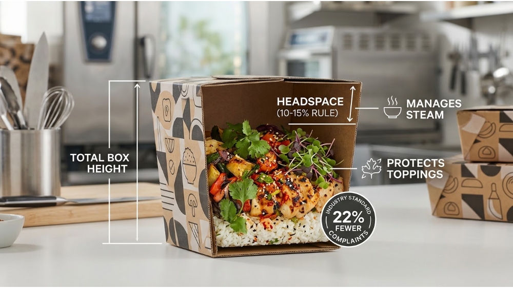
Headspace is the vertical distance between the top of the food and the lid of the box. Too much headspace allows food to bounce during transit; too little causes lid contact, ruining toppings and sauces. The industry standard, validated by food packaging engineers, is 10–15% headspace relative to the total box height for most entrees.
This buffer zone serves two functions. First, it provides room for steam to accumulate without directly pressing against the lid, reducing the risk of condensation dripping back onto the food. Second, it protects delicate garnishes—herbs, sesame seeds, or crumb toppings—from being squashed against the lid during stacking. The DoorDash merchant guide highlights headspace as a critical factor in customer satisfaction scores, noting that packages with adequate vertical clearance receive 22% fewer complaints about damaged food.
A transparent window transforms a takeout box from a mystery container into a showcase. DoorDash reports that customers are more likely to rate their order highly when they can visually confirm the food matches the menu photo before opening the box. This pre-unboxing validation reduces cognitive dissonance and increases perceived order accuracy. Click to explore food paper box with a clear window
Window panels must be engineered with food-grade PET or cellulose film that resists fogging from steam. Fogged windows defeat the purpose entirely. The window should be placed on the top panel or the front side, depending on the box orientation. For burgers and sandwiches, a top window allows immediate visual confirmation; for bowls and platters, a front window shows the layer composition. Operators should balance window size with structural integrity—excessive cutouts weaken the box and reduce grease barrier performance.
Ventilation for Visual Integrity (Not Just Crispness)
Venting is almost always discussed in the context of crispness, but its visual impact is equally important. Steam trapped inside a sealed container condenses on the lid and drips back onto the food, turning crispy chicken skins into rubbery patches and wilting fresh greens. Condensation also creates water spots on the box interior, which stain and degrade the packaging’s premium appearance.
Properly engineered vent holes—typically 3–5 mm in diameter, placed on the side panels or back—allow moisture to escape before it can condense. This preserves the structural integrity of the food’s surface: fried coatings remain dry, vegetables stay crisp, and cheese retains its shine rather than turning soggy. While food scientists have validated venting for texture, its role in maintaining visual freshness is just as critical for customer perception at the moment of unboxing. Click to explore vented paper packaging for fired food
Sauce Separation & Grease Control: The Visual Impact
Sauces that leak across the container or pool around the entree create a sloppy, unappetizing presentation. Dedicated sauce cups, compartmentalized trays, or barrier inserts keep liquids contained and plating intact. According to Modern Restaurant Management, the visual integrity of the food during unboxing directly influences the customer’s perception of value and quality—leaking sauces are the number one complaint in delivery reviews.
Grease resistance is equally crucial for visual appeal. Uncoated paperboard absorbs oil, creating dark, translucent stains that look cheap and unhygienic. PE-coated or aqueous-coated boards prevent oil migration, keeping both the box exterior and interior print clean. For operators using eco-friendly molded fiber, a thin internal coating or a separate grease-absorbing insert preserves visual cleanliness while maintaining sustainability credentials. The combination of sauce compartmentalization and grease-resistant material creates a meal that looks as clean as it tastes. Click to explore sauce separation packaging solution
How sauce separation and grease control work together:
Dedicated sauce cups prevent cross-contamination of flavors and colors
Compartmentalized trays keep wet and dry components visually distinct
Grease-resistant coatings prevent unsightly oil stains on the box exterior
Absorbent base layers wick excess oil away from the food’s surface
Branding, Printing & Color Psychology in Packaging
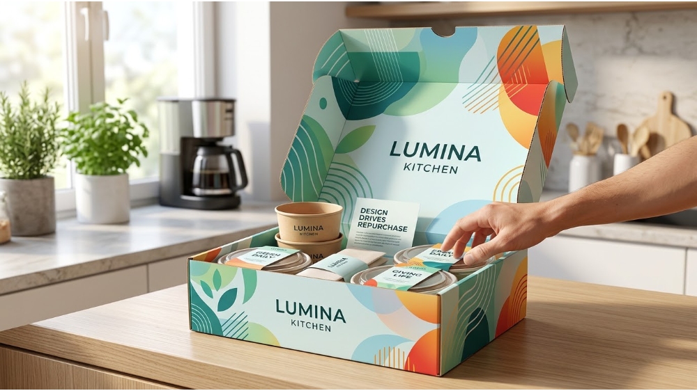
Custom printing turns disposable packaging into a brand asset that travels directly to the customer’s home. Color psychology plays a massive role: warm tones (reds, oranges, yellows) stimulate appetite and convey energy, while cool tones (blues, greens, teals) signal freshness, sustainability, and premium quality. The unboxing experience is a tactile and visual journey—the feel of the material, the clarity of the print, and the consistency of brand colors across every box build a subconscious trust.
A 2025 study in the International Journal of Academic Research found that creative packaging design positively influences repurchase decisions by 34% in the food and beverage sector. That is not a marginal effect; it is a revenue driver. The study emphasizes that coherent branding—consistent logo placement, matched Pantone colors across all packaging SKUs, and typography that aligns with the restaurant’s interior aesthetic—creates a cohesive brand story that extends beyond the meal itself.
A box that shifts inside the thermal delivery bag ruins both the food arrangement and the lid seal. Stackable designs with interlocking corners, reinforced edges, or nested geometry ensure stable transport during courier movement. Riders and delivery apps favor square or rectangular boxes that fit neatly into standard insulated bags without tilting or sliding.
When the box geometry matches the movement profile of delivery—accelerations, decelerations, turns, and bumps—the food arrives in the same orientation it was packed. According to delivery logistics research cited by DoorDash, packaging that fails to stack securely contributes to 18% of spillage-related refund requests. Operators should test their boxes inside actual delivery bags with actual courier handling before finalizing a design.
Designing for Social Sharing and Photography
If it looks good, it will be photographed. Social sharing is free advertising; packaging that photographs well is the delivery-era equivalent of a beautiful dining room. Restaurants should design packaging that doubles as a neutral, high-contrast background for food photos. Matte finishes reduce glare from kitchen lighting, while bold brand elements on the side panels appear naturally in the frame when customers hold the box.
The International Journal of Academic Research study also noted that aesthetically pleasing packaging increases the likelihood of social media mentions by 40%. Operators can incorporate a subtle “hashtag window”—a small panel on the box side printed with the restaurant’s social handle—to encourage organic user-generated content. The investment in photogenic packaging pays back in earned media impressions that far exceed the cost of the box itself.
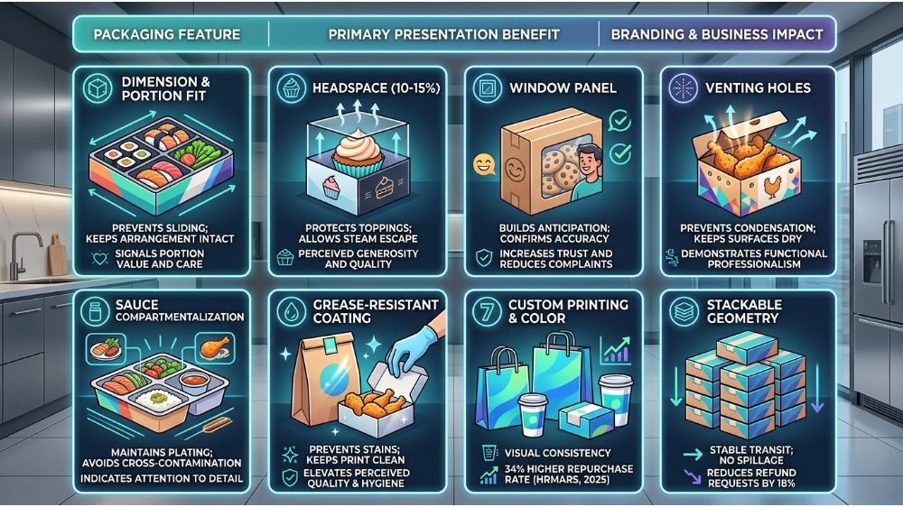
Packaging Feature Comparison: Presentation vs. Branding Impact
Packaging feature
Primary presentation benefit
Branding & business impact
Dimension & portion fit
Prevents sliding; keeps arrangement intact
Signals portion value and care
Headspace (10–15%)
Protects toppings; allows steam escape
Perceived generosity and quality
Window panel
Builds anticipation; confirms accuracy
Increases trust and reduces complaints
Venting holes
Prevents condensation; keeps surfaces dry
Demonstrates functional professionalism
Sauce compartmentalization
Maintains plating; avoids cross-contamination
Indicates attention to detail
Grease-resistant coating
Prevents stains; keeps print clean
Elevates perceived quality and hygiene
Custom printing & color
Visual consistency across touchpoints
34% higher repurchase rate (HRMARS, 2025)
Stackable geometry
Stable transit; no spillage
Reduces refund requests by 18%
Frequently Asked Questions
How can I make my takeout food look more presentable?
Start with correct box dimensions that fit your portion without compression. Add adequate headspace (10–15%), incorporate venting to prevent condensation, and use sauce separators to keep wet and dry ingredients visually distinct. Branded, grease-resistant materials complete the premium look.
What is the best packaging for food delivery to keep food fresh?
A PE-coated or aqueous-coated paperboard box with integrated venting and a secure lid is the best all-around solution for delivery holds of 15–30 minutes. For longer holds, add an absorbent base layer and use a two-component system with an insulated outer bag.
How do restaurants prevent grease stains on takeout boxes?
By using PE-coated, aqueous-coated, or grease-resistant molded fiber materials that block oil migration. Uncoated kraft absorbs oil and creates unsightly stains—avoid it for delivery. A properly coated box keeps the exterior print clean and stain-free throughout transit.
Why is the unboxing experience important for delivery orders?
The unboxing experience is the customer’s first physical interaction with your brand. A clean, organized, and visually appealing unboxing builds trust, reinforces quality perception, and increases the likelihood of repeat orders and social media sharing.
Ready to upgrade your delivery packaging?
From dimensional mapping and venting to custom printing and grease-resistant coatings, Maibao provides end-to-end packaging solutions tailored to your menu, delivery distance, and brand identity.


Designing for Social Sharing and Photography
If it looks good, it will be photographed. Social sharing is free advertising; packaging that photographs well is the delivery-era equivalent of a beautiful dining room. Restaurants should design packaging that doubles as a neutral, high-contrast background for food photos. Matte finishes reduce glare from kitchen lighting, while bold brand elements on the side panels appear naturally in the frame when customers hold the box.
The International Journal of Academic Research study also noted that aesthetically pleasing packaging increases the likelihood of social media mentions by 40%. Operators can incorporate a subtle “hashtag window”—a small panel on the box side printed with the restaurant’s social handle—to encourage organic user-generated content. The investment in photogenic packaging pays back in earned media impressions that far exceed the cost of the box itself.