

This guide explains how to prepare coffee pouch artwork that survives prepress, printing, and filling. It covers dieline structure, bleed and safe zones, CMYK and spot color setup, functional clearances for valves and zippers, printing-method differences, and preflight standards. For related guidance on how nitrogen flushing and print-route decisions interact with your file strategy, the linked sections below show where the packaging decision and the artwork decision overlap.
Coffee Bag Artwork & Dieline: Print-Ready Guide
Coffee Packaging Print Guide
Coffee Bag Artwork & Dieline Guide: How to Prepare Print-Ready Files for Custom Pouches
A coffee bag artwork file is a manufacturing instruction, not a design export. It decides where film is sealed, where the valve is punched, where white ink is laid, and whether the bag survives filling without a reprint. Lock the structure, use the supplier-issued dieline, and treat bleed, safe zones, and functional clearances as engineering boundaries rather than aesthetic choices.
A coffee bag artwork file is one of the few design deliverables that carries direct production consequences. It is not a flat visual layout that a printer interprets loosely. It is the instruction that tells the converter where to seal, where to punch the valve, where to lay white ink, and where the film stops and the window begins.
Confirm the bag structure before opening design software
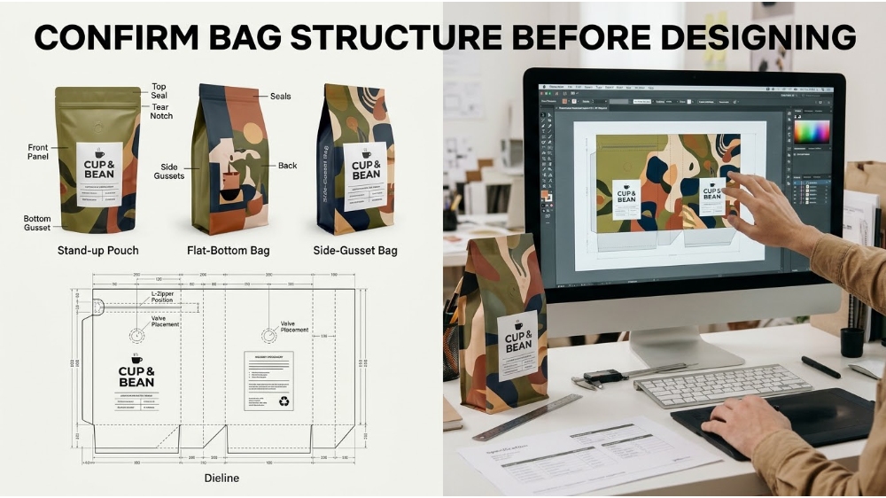
Artwork prepared on an estimated dieline will be repositioned, resized, or rejected after the bag dimensions are finalized. A stand-up pouch, a flat-bottom bag, and a side-gusset bag have different panel counts, fold lines, seal widths, and printable areas. Even two bags with the same fill weight can require different dimensions because coffee density, headspace, and valve placement differ by roast and grind.
Before the first artboard is created, confirm the bag style, final dimensions, material structure, zipper position, valve location, tear notch, top-seal allowance, and printing method. A flat-bottom bag may expose five connected panels. A stand-up pouch concentrates branding on the front panel while the bottom gusset distorts under fill. Designing a hero logo across a gusset fold without a physical mockup is one of the most common causes of unusable print files.
The dieline exists to translate those physical decisions into a flat technical drawing. If the structure is still moving, the file is still moving. Lock the specification first, then design.
What a coffee bag dieline actually controls
A dieline is not a visual template. It is a technical layout showing how the printed film will be formed, folded, and sealed. It defines the overall dimensions, front and back panels, side gussets, bottom gusset, fold lines, heat-seal zones, zipper track, tear notches, valve opening, bleed area, and safe area. Every one of those lines corresponds to a physical action on the converting line.
The single most damaging file error is scaling the dieline to make the artwork fit better. A dieline scaled by even a small percentage will misalign the zipper, shift the valve into a seal, or push copy into a fold. The supplier-issued dieline must be used at 100 percent scale, on its own non-printing layer, and never redrawn from memory. Cut lines, score lines, and seal boundaries belong on that layer, separated from printable art.
A workable file architecture uses a minimum of four named layers: artwork, dieline, white ink, and specialty finishes. If a window, foil, spot UV, or tactile varnish is part of the bag, each requires its own labeled layer so prepress can separate plates without guessing. When the dieline is embedded inside the art layer, the operator cannot remove it from the print output, and the job will either print the dieline or require manual cleanup.
Bleed, trim, and safe zones: the three lines that decide legibility
Bleed protects the outside edge. Trim is the final cut. Safe area protects readable content. These three boundaries are not interchangeable, and confusing them produces bags with white slivers at the seal or text disappearing into a fold.
A practical baseline for coffee pouch artwork is 0.125 inch of bleed beyond the trim line on every side. Some suppliers accept 0.0625 inch for tight formats, while others require 0.25 inch on the top and bottom of large bags. The exact figure depends on the converter, the material, and the printing process. The number that matters is the one written on the approved dieline, not a generic rule found online.
Safe area is the opposite boundary. Critical copy, logos, barcodes, and regulatory information should sit at least 0.0625 inch inside the trim edge, and farther from heat seals, zipper tracks, and gusset folds. Red Dot Packaging recommends keeping critical copy at least 0.25 inch from gusset folds and seals, because film movement during filling can pull artwork into a functional zone that was clear in the flat file. A logo that sits two millimeters from a seal is not a design choice; it is a reprint waiting to happen.
CMYK, spot colors, and the white ink layer
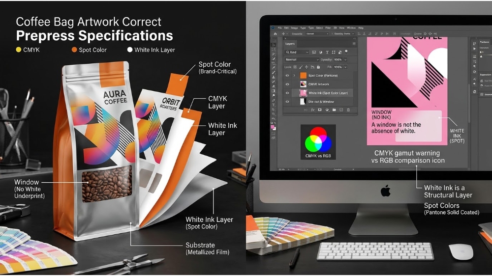
Coffee bag artwork is built in CMYK, not RGB. RGB files contain colors that the press cannot reproduce on film, and the conversion performed at the RIP stage is uncontrolled. Convert images to CMYK before placement, and check that total area coverage stays within the limit specified by the converter for the chosen substrate. On metallized or clear films, CMYK alone will not produce accurate color because the film has no white base.
White ink is a structural layer, not a background color. On clear, metalized, or dark kraft substrates, white must be printed as a dedicated spot color on its own layer, named clearly, and distinguished from areas that are intentionally left unprinted. A window is not the absence of white. It is a defined clear zone that must be separated from white underprint. If the file labels both as white, prepress cannot tell the difference between a window and an opaque panel.
Brand-critical colors that cannot be matched in CMYK should remain as named spot colors, ideally referenced to a Pantone Solid Coated swatch. Do not convert a spot color to CMYK and rename it as a spot. The press will treat it as process build, and the color will drift across runs. Overprint settings also need to be deliberate. Black text is commonly set to overprint to avoid registration gaps, but white ink and light spot colors should generally knock out unless the converter specifies otherwise. A soft proof on a calibrated monitor is useful for content and panel order, but it does not predict how white ink will appear on a metalized film. For color-critical bags, request a proof on the actual substrate.
Functional clearances for valves, zippers, and seals
A coffee bag is a packaging system, not a printed surface. The valve, zipper, tear notch, and top seal each occupy physical space, and artwork must be designed around those spaces rather than over them. A one-way degassing valve is not a decorative circle; it is a pressure-activated component with an application tolerance. The dieline should mark the full valve footprint and the tolerance zone, and no text, barcode, or fine graphic should enter that area.
Valve placement also interacts with the freshness strategy. A valve handles the carbon dioxide that fresh coffee releases, while nitrogen flushing lowers the oxygen level in the headspace before sealing. The two belong to the same packaging decision: the valve manages internal pressure, and the flush manages the starting atmosphere. If the artwork crowds the valve zone, the applicator may shift the valve into a seal or a graphic panel, and the bag either fails to vent or presents a misplaced component on shelf. The file must give the valve a clean landing area, just as the specification must give the coffee a functional atmosphere.
Zippers require similar discipline. The zipper track sits below the top seal and above the fill line. Artwork that crosses the zipper track may look continuous in the flat file but will be interrupted by the closure hardware after conversion. Tear notches must remain clear of print so the consumer can initiate the tear without fighting a layer of ink. Heat-seal zones on the sides and bottom should be treated as non-print areas unless the converter confirms that ink is compatible with the sealing process. A seal contaminated by heavy ink coverage may fail leak testing even though the artwork looked correct.
Barcodes need their own clearance logic. A UPC-A symbol requires quiet zones of at least nine times the X-dimension on each side, and those zones must remain free of graphics, dielines, closures, and cutouts. Build the barcode at its final size rather than shrinking it later, and keep it away from seals and folds. A barcode that scans in the design file but fails in the fulfillment center is a functional defect, not a cosmetic one.
How printing method changes file strategy
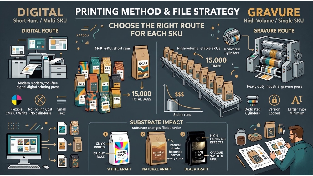
Digital and gravure printing do not require identical file preparation. Gravure uses engraved cylinders, one per color, and those cylinders are a fixed investment in a specific artwork version. Digital has no tooling, which means each design can run as an independent file without cylinder costs multiplying across a range. The printing decision is per SKU, not per brand, and the file strategy should follow the same logic.
For a roaster launching multiple coffee SKUs, the choice between digital and gravure depends on quantity per design, not total order volume. Ten designs of 1,500 bags each behave very differently from one design of 15,000 bags. Digital absorbs that variability without charging each new artwork as a fresh cylinder set. Gravure rewards stable, high-volume designs with lower per-unit cost and consistent color across repeat runs. A file prepared for digital may use a slightly different color build or white ink strategy than a file prepared for gravure, because the two processes reproduce solids, gradients, and fine type differently. The practical rule is to ask the converter for the print route before finalizing the file, not after.
| File consideration | Digital route | Gravure route |
|---|---|---|
| Color build | Flexible CMYK plus spot white | Cylinder-matched, version locked |
| White ink strategy | Job-specific spot layer | Dedicated spot cylinder |
| Minimum type size | Tolerant of small text | Requires larger minimum |
| Version changes | New file, no tooling cost | New cylinder set per change |
| Best fit | Multi-SKU, short runs | High-volume, stable SKUs |
Substrate also changes file behavior. White kraft gives CMYK the brightest base; natural kraft warms and mutes unbacked colors. Black kraft generally needs opaque white, foil, or selected spot effects to achieve contrast. A file that looks correct on a white paper proof may lose its hierarchy on natural kraft because the paper shade becomes part of every color. Request the approved substrate reference and judge proofs under controlled light before approving the final PDF.
Preflight, export, and multi-SKU file management
Preflight is the last high-value check before the file leaves the design team. It should confirm that the dieline is non-printing, colors are in the correct mode, images meet the minimum effective resolution at final size, fonts are embedded or outlined, overprint settings are intentional, barcode quiet zones are clear, and transparency has been resolved. Adobe’s preflight tools can flag color, font, transparency, resolution, ink coverage, and PDF compatibility issues, but the operator still has to know what the converter expects.
The export standard for most coffee bag projects is PDF/X-4, with marks off unless the converter asks for them. If the supplier requests native files, package the links and fonts alongside the document. Do not flatten the file to simplify it. Flattening destroys the layer separation that prepress needs to isolate white ink, dielines, and finishes. A flattened PDF may look correct on screen and fail at the RIP because the white layer and dieline have merged into the artwork.
Print-ready file checklist:
- Dieline on its own non-printing layer, at 100 percent scale
- Artwork extends 0.125 inch past trim on every side
- Critical copy at least 0.0625 inch inside trim and clear of seals
- Colors in CMYK, spot colors named and not converted
- White ink on a separate labeled spot layer, window defined separately
- Valve, zipper, and tear-notch zones free of print and graphics
- Barcode quiet zones clear, symbol at final size
- Fonts embedded or outlined, transparency resolved, PDF/X-4 export
Multi-SKU coffee ranges benefit from a controlled master file rather than a separate design for every bag. Keep the dieline, logo position, mandatory copy zones, core color logic, and finish plan consistent across the family. Variable origin, roast, tasting notes, grind, weight, and barcode information should occupy defined fields that can be swapped without rebuilding the structural layers. This approach reduces prepress cleanup, prevents version drift, and makes future extensions easier to approve.
Frequently asked questions
Should the dieline be included in the final PDF?
The dieline should be present in the file as a separate non-printing layer or a clearly named spot color set to overprint. It must not be removed entirely, because prepress needs it to align the artwork, but it must not appear as a visible printed element. If the converter asks for a PDF with the dieline omitted, follow that instruction and keep the layered native file available.
How much bleed does a coffee pouch need?
A practical baseline is 0.125 inch on every side, with some suppliers specifying 0.0625 inch for tight formats and 0.25 inch for large top and bottom areas. The approved dieline overrides any generic rule. If the artwork does not extend into the bleed area, the trim tolerance can expose a white edge at the seal.
Can one file be used for both digital and gravure printing?
A well-layered master file can usually be adapted to either route, but the color build, white ink strategy, and minimum type sizes may need adjustment. Gravure reproduces large solids and fine gradients differently from digital, and the cylinder cost is tied to a specific color separation. Ask the converter to confirm the print route before finalizing the file, especially for multi-SKU ranges.
What resolution should images be in a coffee bag file?
Raster images should be at least 300 PPI at their effective final size. Logos, line art, and small type should remain vector. Do not place a high-resolution image and then scale it down after placement, because the effective resolution changes with the final dimensions. A 300 PPI image placed at 50 percent becomes 600 PPI effective, while the same image placed at 200 percent becomes 150 PPI and will print soft.
Need a print-ready coffee bag file reviewed before it reaches the press?
Share your dieline, artwork layers, and bag specification with a packaging specialist who can check clearances, color setup, and export standards against the actual print route.
Post time: Nov-13-2026