

This guide is written for packaging buyers, procurement teams, and brand managers who approve custom printed paper buckets for foodservice or retail. It explains why the flat proof and the formed bucket are two different design problems, and how to structure approval so a correct file becomes a correct container.
Custom Paper Bucket Artwork Errors: Dieline, Seam & Proof Guide
Custom Print Production Guide
Why Custom Paper Bucket Artwork Goes Wrong: Tapered Panels, Seam Allowance, Color Matching, and Proof Approval
Most custom paper bucket artwork fails after forming, not in design: tapered panels, seam overlap, substrate color drift, and proof-stage confusion are predictable. Engineer the file for the formed bucket and approve it where errors are still free to correct.
A paper bucket is not a flat surface. It is a truncated cone formed from a fan-shaped blank, joined at a vertical side seam, with a curled rim at the top and a turned-in base at the bottom. Every one of those features changes what happens to artwork that looked correct on a rectangular screen. The four failure points that cause most reprints — taper distortion, seam overlap, substrate color drift, and proof-stage confusion — are predictable, and each has a specific control point.
Why Tapered Panels Distort Artwork After Forming
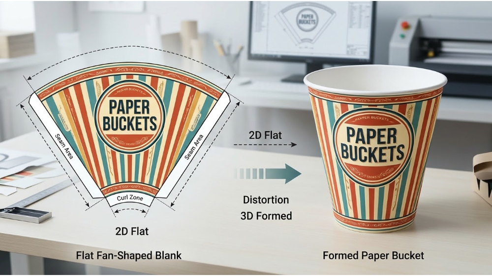
The sidewall of a paper bucket is printed on a flat fan-shaped blank, then rolled and seamed into a cone. Artwork that runs vertically on the flat sheet becomes angled on the formed bucket; a circular logo becomes slightly elliptical; and fine text near the top or bottom curve can compress or stretch as the paper wraps around the taper.
This is not a printing defect. It is a predictable consequence of mapping a two-dimensional graphic onto a conical surface. The production dieline should carry the compensation: the artwork is pre-warped or placed on a curved template so that the formed result — not the flat sheet — matches the intended visual. When that compensation is skipped, or when a generic template is used instead of the bucket’s actual tooling drawing, distortion survives into production.
The practical control is to treat the dieline as a geometry document, not a layout suggestion. Ask for the production dieline with the seam, trim, curl, and no-print zones marked, and approve composition on a three-dimensional mockup before approving a formed printed sample for scale and distortion. A digital rendering is useful for orientation, but it cannot show how the taper compresses a thin stroke or how a pattern aligns around the cone.
Where taper distortion concentrates:
- Circular logos and badges placed high on the wall, where the cone curvature is greatest
- Thin horizontal rules or borders that wrap around the full circumference
- Small text near the rim curl or the bottom turn, where forming reduces the safe print zone
- Patterns that must meet continuously across the visible wall
The simplest preventive rule is to keep the primary brand mark on the strongest viewing panel and keep fine copy away from the areas the forming tool physically changes. Taper is not a reason to abandon detailed artwork. It is a reason to decide which parts of the design must stay geometrically stable and which parts can absorb the cone’s curvature. If cardboard barrels require so many compromises in artwork, is printing on cardboard barrels still worth it compared to another common structure (molded fiber barrels)?
Seam Allowance: The Hidden Zone That Eats Your Layout
The side seam is where the two ends of the printed fan overlap and bond. It is structurally essential, but it is visually hostile to artwork. A logo placed too close to the seam edge can disappear into the overlap, and a design element that is meant to continue across the seam may show a visible mismatch after forming.
Converter specifications vary, but a common allowance is on the order of 1.5 mm of potential object mismatch across the sealing zone even when the artwork is continued into the bleed. The seam is matched on the visible area, but the physical overlap means the two sides are not guaranteed to align with the precision of a single printed sheet. Borders, thin rules, and symmetrical patterns that cross the seam are the most vulnerable because a shift of a millimetre reads as a broken line or an off-center composition.
The correct approach is to design the seam as a deliberate boundary, not as an invisible join. Keep the main logo and critical copy inside a safe area that ends before the seam influence zone. If a pattern must continue, extend it through the bleed so the visible area is matched, but accept that the seam itself will carry a mechanical overlap. The dieline should mark the seam zone, and the formed sample — not the flat proof — should be the evidence that the logo is not partially hidden.
The seam is the one place where “correct on the flat sheet” and “correct on the bucket” can legitimately disagree. The approval question is not whether the seam is invisible, but whether the visible design survives the overlap.
For repeat orders, retain a formed sample with the seam position marked alongside the approved flat blank. If the substrate, tooling, or printing route changes, the seam presentation should be rechecked before the reorder is released.
Color Matching on Paper Buckets: Why the Screen Lies and the Substrate Decides
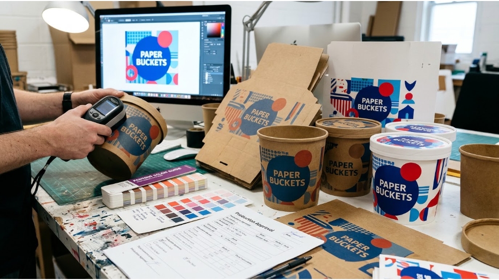
Color is the second major source of artwork failure, and the most avoidable. A brand color approved on a monitor or a digital PDF has not been printed on the actual board. Screens are backlit and emissive. Paper is reflective and absorbs ink differently depending on coating, fiber, and surface texture. The same ink that produces a deep, saturated blue on coated white board can read duller, warmer, or lighter on natural kraft.
Pantone matching is the industry’s standard reference because it uses pre-mixed spot inks with a defined code, rather than relying on a four-color CMYK build to approximate a brand shade. But even a Pantone reference is not a promise of an exact match across every substrate. Coatings, barrier treatments, varnishes, and the board’s own base color all shift the final appearance. The practical target is a controlled, measurable tolerance — not an abstract “exact” — agreed against a physical sample on the actual material.
A spectrophotometer reading expressed as Delta E is useful for quantifying closeness: a reading below roughly 3 is generally considered a very close visual match, while higher readings may still be acceptable depending on the color and the brand’s sensitivity. The important point for approval is not the number alone. It is that the number is tied to the substrate and finish actually being produced, not to a generic swatch or a screen preview.
What a color approval should fix in writing:
- The named color reference (Pantone code or approved physical standard)
- The substrate and coating/barrier treatment being used
- The measurement condition or viewing condition, agreed in advance
- The acceptable tolerance, and whether the reference is flat stock or formed surface
- A retained signed sample that both parties treat as the production reference
Without those conditions written down, two teams can look at the same bucket under different lighting and reach different conclusions — not because either is wrong, but because “match” was never defined against a physical target.
Proof Approval: What Each Proof Covers — and What It Cannot Cover
Most proof-stage disputes come from treating one proof as if it guarantees everything. A soft PDF is a layout and copy check; it is not a color contract. A 3D render is a structure and orientation check; it is not a press sheet. A physical pre-production sample shows color and forming on the real substrate, but it still may not represent the full production run’s registration stability.
The disciplined approach is to match the proof type to the question being answered. Content, spelling, panel orientation, and dieline logic belong on a soft proof. Structure, seam placement, taper distortion, and whether the logo reads correctly on the formed cone belong on a formed physical sample. Color belongs on a physical proof made with the specified ink on the specified substrate, viewed under agreed conditions. Registration stability — whether the print-to-cut alignment holds across the run — is a production control question, not something a single beautiful sample can prove.
| Proof type | What it can confirm | What it cannot confirm |
|---|---|---|
| Soft proof (PDF / screen) | Copy, spelling, panel orientation, dieline placement | Color on substrate; forming distortion; seam survival |
| 3D render / mockup | General composition, fold logic, orientation of panels | Press color; exact taper distortion; tactile finish |
| Physical formed sample | Color on the real board, seam position, rim/base forming, legibility after curvature | Run-length registration consistency; packing durability |
| Press / running sheet | Real ink on real substrate under production conditions | Formed-container geometry (unless it is also formed) |
The most expensive proof mistake is approving color from a screen, followed closely by approving a flat proof that never shows the seam or the taper. A formed physical sample is not a luxury for a first run; it is the only proof that lets a buyer see what the customer will actually hold.
A Practical Approval Sequence for B2B Paper Bucket Orders
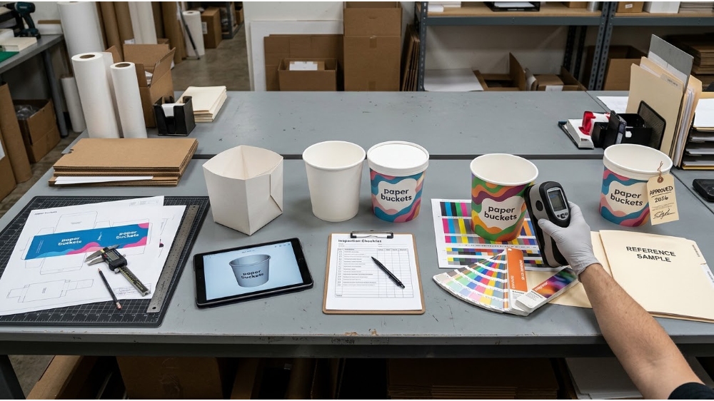
A repeatable sequence removes most of the ambiguity. The order matters because each stage narrows what the next stage is responsible for.
First, lock the production dieline and the artwork revision together. The dieline should come from the actual bucket tooling, not a generic template. Mark the seam, trim, curl, bottom forming zone, and safe print area. If the dieline revision and artwork revision do not match, the approval is already unstable.
Second, approve composition on a 3D mockup or folded proof. This is where panel orientation errors, upside-down side panels, and obvious seam collisions are caught. It is not where color is judged.
Third, approve a formed physical sample for scale, seam, and taper distortion. Check the logo near the seam, the smallest text after curvature, and whether the pattern meets as intended. This is the proof that answers the question the flat sheet cannot answer.
Fourth, approve color on a physical target under agreed conditions. If the color is brand-critical, the target should be on the actual substrate with the actual coating. Retain an unexposed or signed sample as the reference for the run and for future reorders.
Fifth, define what triggers reapproval. A change of substrate, a change of printing route, a change of tooling, or a change of artwork revision should reopen the relevant approval. A reorder is not automatically covered by the first approval if any of those variables have moved.
Approval questions that prevent most reprints:
- Is the dieline revision the one the tooling was built for?
- Does the logo sit inside the safe area, away from the seam influence zone?
- Has the smallest text been checked on the formed bucket, not the flat proof?
- Is the color target a physical sample on the actual substrate?
- Is there a signed reference sample retained for the run and the reorder?
This sequence does not make production perfect. It makes the errors visible at the stage where they cost a proof revision rather than a full reprint. For buyers sourcing custom paper buckets through a one-stop packaging partner, the value of the sequence is that it turns artwork approval into a shared, documentable process rather than a subjective sign-off.
Frequently Asked Questions
Why does my logo look distorted on a paper bucket even though the artwork file is correct?
The flat artwork has not been compensated for the cone. A paper bucket is formed from a fan-shaped blank, so vertical lines angle and circles become slightly elliptical after rolling. The production dieline should carry that compensation; approving a formed sample is the only reliable way to confirm the result.
Can I approve color from a digital proof or a phone screen?
No. A screen is backlit and cannot show how ink sits on paper, kraft, or coated board. A physical proof or formed sample on the actual substrate is the only reliable color reference, especially for brand colors that are sensitive to coating and base-board shade.
How close can a custom paper bucket color match be?
A close visual match is achievable, but an exact match across different substrates and finishes is not something any converter can guarantee. The practical approach is to agree a named reference, a substrate, a viewing condition, and a measurable tolerance, then retain a signed physical sample as the production standard.
What is the most important proof to approve before a bulk order?
A formed physical sample is the single most useful proof because it shows seam position, taper distortion, and color on the real board at the same time. A flat PDF is useful for copy and layout, but it cannot prove what the finished bucket will look like.
Need paper bucket artwork that survives the forming line?
Talk to a packaging specialist about dieline compensation, seam-safe layout, physical color approval, and a proof sequence built for your menu and delivery format.
Post time: Nov-03-2026