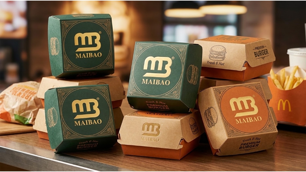
Global Fast Food Market Aesthetic & Printing Differences for Burger Boxes
Burger Box Printing & Design Differences by Global Market
Burger Box Design & Printing Guide
Global Fast Food Market Aesthetic & Printing Differences for Burger Boxes
Cultural cues vary: ink/coating rules, PFAS limits, languages, marks, and run length decide compliance. Use one master artwork with locked brand elements plus local layers. Brief printers per market so one design ships compliant everywhere.
A burger box is a printed surface doing three jobs at once: selling the brand from arm’s length, carrying required information, and surviving grease and steam. Markets weight those jobs differently, which is why a global chain’s box in Munich, Riyadh, Mumbai, and Tokyo looks like a family rather than a copy.
This guide covers graphics and printing only, not box structure or venting. It is written for chains, franchisees, and brand owners who order custom printed burger boxes for more than one country.
What Really Drives Burger Box Print Differences Between Markets
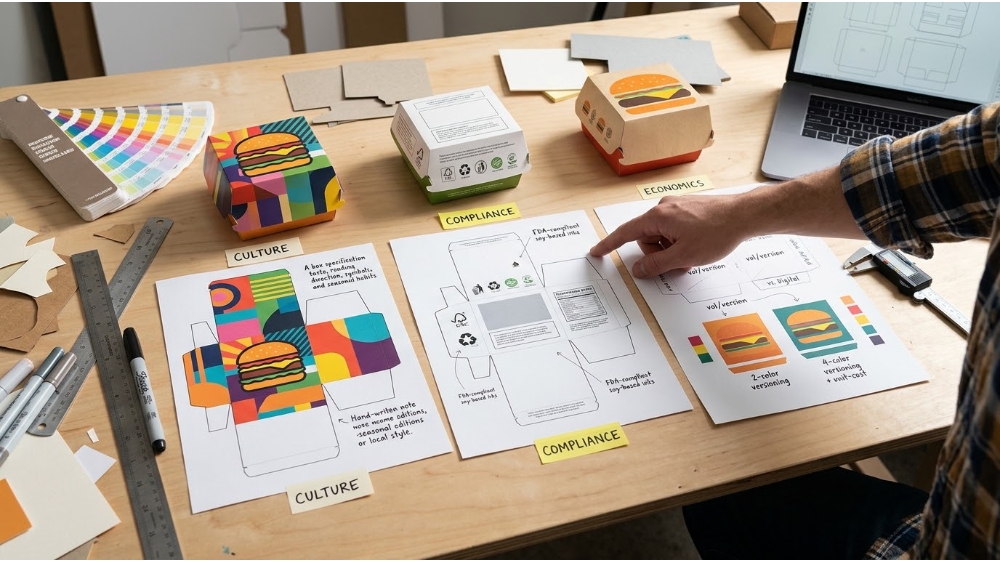
Three forces shape every regional burger box specification: culture, compliance, and economics. Most redesigns go wrong when a team treats culture as the only variable and discovers the other two at the press check.
Three forces behind every regional print spec:
Culture: taste, reading direction, symbols, and seasonal habits set the look
Compliance: allowed inks and coatings, mandatory language, required marks, and chemical limits set the minimum
Economics: volume per version and the number of versions set the print method
Compliance defines what you may print, economics decides how you can afford to print it, and culture shapes how it looks inside those limits.
Aesthetic Differences by Region: US, Europe, the Gulf, India, and Japan
Each market rewards a different visual priority. The table after the regional notes turns those priorities into a print brief.
United States and Canada: saturated color and a big logo
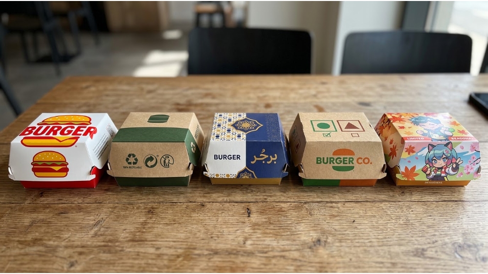
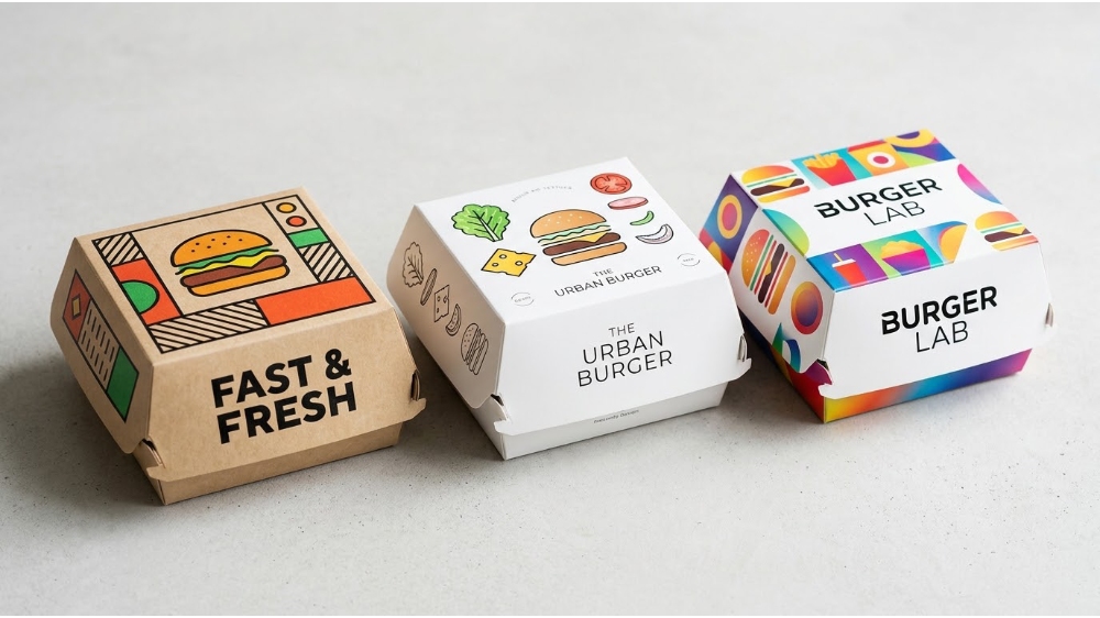
Large national chains typically rely on saturated brand colors, oversized logos, and appetite-driven graphics that read from across a counter or a delivery doorstep. Gloss on white board suits that look. Independent burger shops increasingly choose natural kraft with one- or two-color line art to signal craft, a different print job with less ink and simpler artwork.
Europe: restraint and sustainability cues
European boxes lean toward muted palettes, natural board tones, and visible recycling and sorting icons. The shift can be deliberate at brand level. In 2009, McDonald’s began replacing its red backdrop with deep green in parts of Europe to project an eco-friendly image. Multi-country boxes also need flexible text zones for local-language copy.
The Gulf: Arabic-first and bilingual
In Saudi Arabia, the UAE, Qatar, and neighboring markets, Arabic reads right to left, so layouts are often mirrored rather than simply translated. GCC rules for prepackaged food require Arabic on the label, with any second language alongside it. Takeaway boxes sit in a different category, but brands commonly design bilingual panels anyway, because a box that reads naturally in Arabic feels local.
India: the vegetarian and non-vegetarian symbols
India requires a vegetarian or non-vegetarian mark on prepackaged food: a green filled circle inside a green square, or a brown filled triangle inside a brown square. The triangle replaced an older brown circle so that color-blind customers can tell the two marks apart by shape. Brands with mixed menus therefore typically reserve clear space for the symbol on the box face.
Japan and East Asia: character art and seasonal rotation
Japanese chains often put their creative work on wrappers and paper bags, so rigid boxes tend to serve delivery and premium lines. Limited-time collaborations are a hallmark. Mos Burger’s Kirby promotion put the character on takeout bags and burger wrappers, and the translucent paper let the artwork show through while customers ate. Frequent rotation tends to mean short runs, which shapes the print method choice below.
Market
Visual priority
Plan print space for
Biggest print risk
US / Canada
Saturated color, large logo, appetite imagery
Large brand panel, campaign QR codes
Solid reds and yellows drifting between production runs
Europe
Muted palette, natural tones, eco cues
Recycling icons, local-language text zones
Artwork built for white board looking flat on kraft
Gulf (GCC)
Arabic-first, bilingual, geometric motifs
Right-to-left Arabic panel; halal mark only with valid certification
Fine Arabic strokes filling in at small sizes
India
Vivid color, local-language copy
Veg / non-veg symbol with fixed shape and color
Muddy green or brown weakening the symbol
Japan / East Asia
Character art, seasonal themes, fine detail
Collaboration art, credit lines where licensors require them
Short runs raising cost per box
Color and Substrate: Why One Brand Red Prints Three Ways
A brand color is not a single color on a box. The substrate changes how the same ink looks, and the substrate often differs by market. Bright white coated board gives the widest, cleanest color range. Natural kraft is darker and warmer, so reds drift toward brick and light tints nearly disappear.
Two fixes work in practice. Specify brand colors as Pantone spot colors rather than CMYK builds, so the printer matches a reference instead of an approximation. For kraft, either add a white underprint beneath key color areas or redesign the artwork for the board with fewer colors, bolder shapes, and heavier line weights. Approve a press proof on the actual board, not a screen image.
Substrate rules of thumb:
White coated board: best for saturated solids, photography, and fine gradients
Natural kraft: best for one- or two-color line art, stamps, and bold typography
Recycled or mixed-fiber board: expect some tone variation; agree a tolerance with your supplier
Flexo, Offset, or Digital: Choosing the Print Method
Volume and artwork complexity decide the method, but the number of markets decides how often you face the decision. In analog printing, every extra language or regional version means another set of plates. Digital printing removes that multiplier. See the Full Guide of Food Box Logo Printing: Flexo vs Offset vs Digital.
Flexographic printing
Flexography presses ink from flexible relief plates onto the board at high speed, using fast-drying inks and delivering a low cost per box at volume. It does not match offset for fine detail, so it suits core menu boxes with bold graphics and large runs.
Offset lithography
Offset delivers the finest detail and very consistent color across long runs, which suits photographic or heavily illustrated boxes. Setup costs are higher, so it pays off at volume. Printed sheets are typically coated, then die-cut and folded into boxes.
Digital printing
Digital printing uses no plates, so it fits short runs, regional test markets, seasonal collaborations, language variants, and campaign-specific QR codes. Unit cost is higher at volume, and ink systems differ in their food-contact documentation, so request compliance papers for the specific press and ink.
Finishes and Coatings: Premium Cues vs. Recyclability
Finishes signal positioning, but the same finish can carry different risks in different markets. Aqueous or gloss coating deepens color and adds some grease and moisture resistance. Spot UV and foil accents suit premium lines. Matte and soft-touch lamination look upscale but often add a plastic layer.
That plastic layer matters where recyclability is part of the brand promise or the regulatory climate, notably in Europe. Plain aqueous coatings and uncoated kraft keep the box simple to recycle. Choose the finish only after the compliance check below, because coatings are now part of the chemical-compliance file, not just decoration.
Ink and Labeling Rules That Change the Artwork
In the EU, printed food packaging must satisfy Framework Regulation (EC) No 1935/2004 and the Good Manufacturing Practice Regulation (EC) No 2023/2006. For inks on the outer, non-food side, the GMP rules require that substances do not transfer to the food side through set-off or otherwise. EU law does not yet fully harmonize printing-ink rules, so many companies use Switzerland’s printing ink ordinance and its positive list as a working benchmark.
Since 12 August 2026, the EU’s Packaging and Packaging Waste Regulation has barred food-contact packaging from the market when PFAS exceed set limits: 25 parts per billion for any single non-polymeric PFAS, 250 parts per billion for the sum of non-polymeric PFAS, or 50 parts per million for total PFAS, including polymeric ones. Grease-resistant paper, fast-food packaging, barrier coatings, inks, and adhesives are flagged as higher-risk areas. Stock placed on the market before that date may stay on sale; anything placed after it must comply.
Other markets add labeling rules rather than chemical ones. In the Gulf, any halal logo or claim on pack must be backed by a valid halal certificate. India’s vegetarian and non-vegetarian symbols have fixed shapes and colors. Both sets of rules are written mainly for prepackaged food, so confirm with the local regulator or your supplier how they apply to restaurant takeaway boxes.
Artwork checklist before you approve a print file:
Ink sits on the outer, non-food-contact side, with supplier compliance documents for ink and coating
PFAS-free declarations cover the coating, ink, and adhesive on EU shipments
Arabic panel is checked by a native reader; any halal mark is tied to certification
Veg / non-veg symbols use the correct shape and color, with clear space
Local-language legal and recycling copy is confirmed for each country
How to Run One Burger Box Design Across Many Markets
Build a master system with locked layers and flexible layers. Lock the logo, the reference brand colors, the type hierarchy, and the hero graphic. Leave flexible the language panel, substrate-specific color tuning, mandatory marks, finish, and seasonal art.
Then work in this order: reserve zones on the dieline for local text and marks; set Pantone and substrate-specific color values; clear each market’s compliance points; approve a press proof on the real board; and finally choose the print method from volume and version count. A correct file can still print as a disappointing box if nobody checks it on the real board.
The visual differences between markets are real, but they are the easy part. The costlier ones are substrate behavior, ink and coating compliance, and the number of versions you must print. Settle those early and local teams can adapt the look freely. For a sourcing consultation on custom printed burger boxes, ink and coating choices, and print methods matched to each market you sell in, contact Maibao Packaging.
Need burger boxes that print right in every market you sell in?
Talk to a packaging specialist about artwork zones, board and ink choices, finishes, and print methods matched to each market on your list.
Keep one Pantone reference for the brand, but expect it to look different on white board and kraft. Adjust the ink build or add a white underprint for the substrate rather than changing the brand color itself.
Is kraft cheaper to print than white board?
Not automatically. Kraft often looks best with fewer colors, which can cut ink and plate costs, but heavy coverage or bright colors may need a white underprint.
Do I need new print plates for every language?
In flexo and offset, yes, but only for the plates that carry the changed text. If local copy sits on its own color, one plate may be enough. Digital printing needs no plates at all.
What files do printers need for custom printed burger boxes?
Send vector artwork on the supplier’s dieline, with fonts outlined, Pantone references, and bleed (commonly 3 mm). Mark zones reserved for mandatory symbols and codes so folds and glue areas do not cover them.
Post time:
Oct-19-2026
For inquiries about our products or pricelist, please leave your email to us and we will be in touch within 24 hours.